


Dixie Grace


Project Context
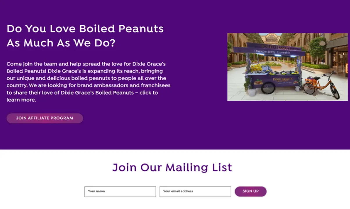
Dixie Grace requested a redesign of its website homepage to better align the digital experience with the brand’s premium positioning. The company offers boiled peanuts elevated into a modern experience, reinventing a traditional snack through its own process (“The Dixie Grace Way”), which combines technique, bold flavors, and practical, high-quality packaging.

The current homepage does not reflect Dixie Grace’s premium positioning nor effectively communicate the product’s unique value. Its design appears amateur, lacks natural visual cues connected to the peanut’s origins, and is not optimized to guide users toward conversion. This creates a gap between the product’s true quality and the perception conveyed by the site, impacting both the brand experience and the ecommerce’s commercial performance.

The current homepage does not reflect Dixie Grace’s premium positioning nor effectively communicate the product’s unique value. Its design appears amateur, lacks natural visual cues connected to the peanut’s origins, and is not optimized to guide users toward conversion. This creates a gap between the product’s true quality and the perception conveyed by the site, impacting both the brand experience and the ecommerce’s commercial performance.

Redesign the homepage with a professional UX/UI approach that elevates the visual aesthetic, strengthens the brand’s premium identity, and improves conversion. This involves implementing a more natural and modern visual direction, incorporating imagery that connects the product to its origins, optimizing content hierarchy, updating typography, and reorganizing the layout to clearly guide the user toward action. The result will be a cohesive, appealing, and functional homepage that accurately represents Dixie Grace’s value and drives online sales.
Testimonials
.webp)

The redesign completely transformed how Dixie Grace is perceived. We went from an outdated look to a fresh and authentic identity that truly reflects the handcrafted essence of our boiled peanuts. Our customers now understand who we are and what makes us special. The new design elevated our presence, boosted online sales, and helped us stand out. It was worth every penny!


The redesign completely transformed how Dixie Grace is perceived. We went from an outdated look to a fresh and authentic identity that truly reflects the handcrafted essence of our boiled peanuts. Our customers now understand who we are and what makes us special. The new design elevated our presence, boosted online sales, and helped us stand out. It was worth every penny!
Design & Development Process

Briefing
Competitors Analysis
UX Analysis
Definition of User Persona
.png)
Userflow & Sitemap
Lo-Fi & Hi-Fi Wireframes
Clickable Prototype
Usability Testing
.png)
Branding
UI & UI-Kit
Responsive Design
High Fidelity Prototype
Usability Testing
Hand-off to Development
.png)
CMS implementation (WordPress-Elementor / Shopify / Webflow)
CMS Configuration
Responsive Optimization
SEO Improvements (optimized content & images)
Final Testing & QA
Final Project Deployment
Design Process
Briefing
Competitors Analysis
UX Analysis
Definition of User Persona
Userflow & Sitemap
Lo-Fi & Hi-Fi Wireframes
Clickable Prototype
Usability Testing
Branding
UI & UI-Kit
Responsive Design
High Fidelity Prototype
Usability Testing
Hand-off to Development
Color Palette
Typography
Brand Identity
User Persona
Logo
Lo-Fi Wireframes
Previous Design
The previous design of Dixie Grace was characterized by an outdated look—an aesthetic the company felt did not accurately represent or communicate the handcrafted essence of its boiled peanuts. This made it difficult for customers to fully understand the brand’s identity and what made it unique. In essence, it was a presentation that did not match the quality of the product, limiting the brand’s ability to stand out in the market.
.webp)
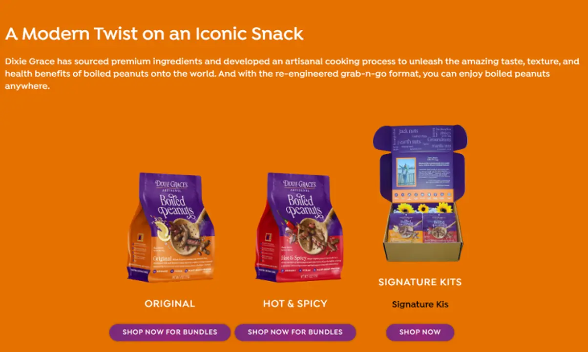
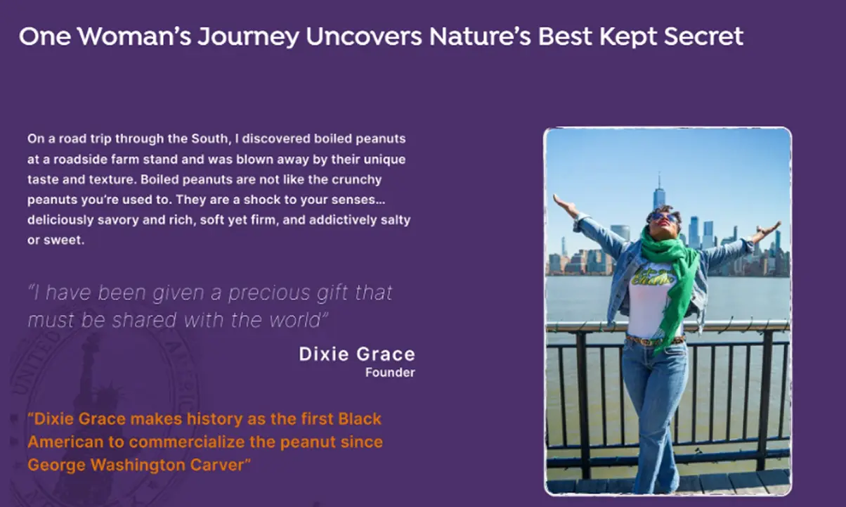

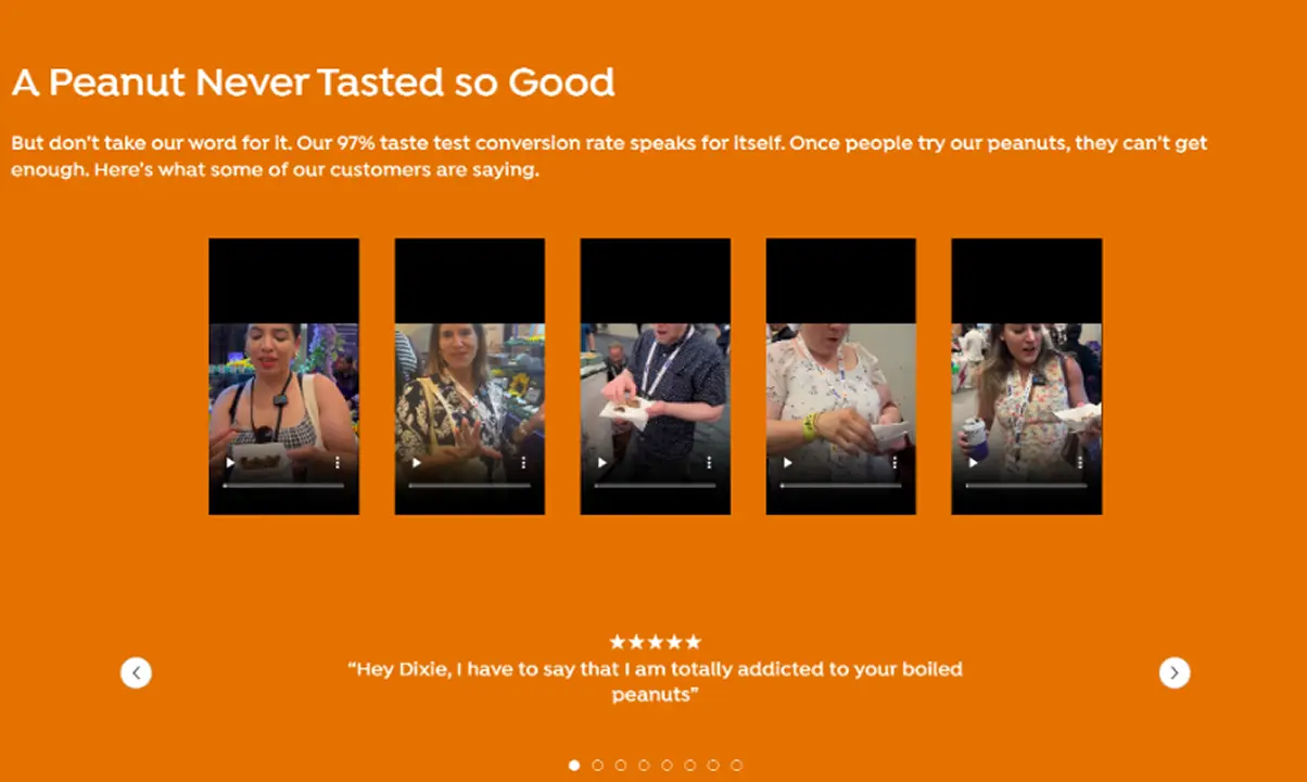


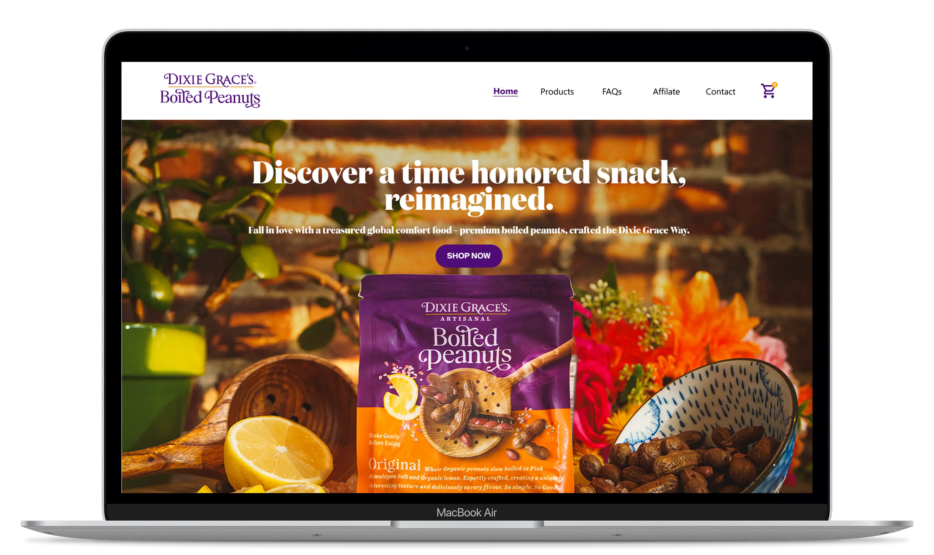
The Revamped Experience
The redesign of Dixie Grace’s homepage achieved a complete transformation in perception, shifting from a look described as “outdated” to a fresh, authentic, and modern high-impact identity. This new design successfully conveyed the handcrafted essence of the boiled peanuts, which had previously been missing. As a direct result, the elevated branding significantly boosted online sales, proving that the revamped identity was not just an aesthetic improvement but a fully justified business investment.
.webp)
.webp)
.webp)
.webp)
.webp)
.webp)
.webp)
.webp)
The Mobile Revamped Experience

Here are the key features implemented in the redesign, focused on elevating the visual experience, optimizing navigation, and reinforcing Dixie Grace’s premium positioning—resulting in a more coherent, appealing, and effective homepage.


Optimization of the main copy and messaging
The text was updated to better reflect Dixie Grace’s premium, natural, and modern tone. The new copy clearly communicates the product’s unique value and creates a more cohesive brand experience.

Image selection and enhancement
Images were replaced and refined to achieve a more natural and authentic look aligned with the product’s origins. This brings a more elevated feel and reduces the “cartoonish” aesthetic of the previous design.

Layout redesign to improve navigation
Key sections were reorganized to guide users more intuitively, highlighting packshots, benefits, and calls to action. The visual flow is now clearer, more hierarchical, and more conversion-driven.

Visual refinement to elevate brand aesthetics
Typography and spacing were updated to create a more modern interface aligned with Dixie Grace’s premium positioning. This includes a more balanced integration of purple/orange and the addition of more refined visual elements.
Creating an Intuitive and Efficient Digital Experience

Redesign process
The redesign began with an analysis of the current site to identify friction points, visual inconsistencies, and improvement opportunities. From there, priorities were defined together with the client, the content structure was reorganized, and a visual proposal was developed that aligns with the brand’s premium and natural tone.
User Flows
The user flow was optimized to make navigation clearer and more conversion-oriented. The main sections of the homepage were reorganized to first present the product’s value, followed by its benefits and calls to action, enabling a more intuitive and engaging journey.

Visual Design
The visual design was updated with a more modern, clean, and natural direction. More readable typography was incorporated, and imagery was chosen to connect the product to its origins. The result is an elevated, cohesive aesthetic that accurately represents Dixie Grace’s positioning.
Conclusion
The homepage redesign aligned the digital experience with Dixie Grace’s premium identity, improving message clarity, visual appeal, and overall user flow. The new design elevates brand perception, communicates the product’s value more effectively, and establishes a stronger foundation for higher conversion and a more coherent online presence.