MUZE Packaging


.webp)
Project Context
Muze is a Latina-founded bean-to-bar chocolate company operating between Ecuador and New York. In recent years, the cacao niche has expanded rapidly, attracting many new competitors and increasing pressure on existing brands. To remain relevant and competitive, Muze recognized the need to refresh its brand presence and expand into new product categories that respond to modern consumer expectations for both wellness and transparency.

Growing competition within the cacao niche over the past five years weakened Muze’s market positioning and limited sales growth. The brand struggled to stand out visually, differentiate its offering, and effectively communicate its value in an increasingly crowded space.

Growing competition within the cacao niche over the past five years weakened Muze’s market positioning and limited sales growth. The brand struggled to stand out visually, differentiate its offering, and effectively communicate its value in an increasingly crowded space.

Muze initiated a comprehensive brand renewal focused on two pillars: A full update of its visual identity, improving clarity, shelf impact, and brand cohesion. The development of a new line of value-added functional chocolate products, formulated with natural ingredients designed to support sleep, focus, relaxation, and vitality. This positioned the brand at the intersection of indulgence, health, and purposeful consumption.
Testimonials
.webp)
Design & Development Process

Briefing

Competitors Analysis

UX Analysis

Definition of User Persona
.png)
Userflow & Sitemap
.png)
Lo-Fi & Hi-Fi Wireframes
.png)
Clickable Prototype
.png)
Usability Testing
.png)
Branding
.png)
UI & UI-Kit
.png)
Responsive Design
.png)
High Fidelity Prototype
.png)
Usability Testing
.png)
Hand-off to Development
.png)
CMS implementation (WordPress-Elementor / Shopify / Webflow)
.png)
CMS Configuration
.png)
Responsive Optimization
.png)
SEO Improvements (optimized content & images)
.png)
Final Testing & QA
.png)
Final Project Deployment
Design Process

Briefing

Competitors Analysis

UX Analysis

Definition of User Persona
.png)
Userflow & Sitemap
.png)
Lo-Fi & Hi-Fi Wireframes
.png)
Clickable Prototype
.png)
Usability Testing
.png)
Branding
.png)
UI & UI-Kit
.png)
Responsive Design
.png)
High Fidelity Prototype
.png)
Usability Testing
.png)
Hand-off to Development
Color Palette

Typography


Brand Identity


User Persona

Logo


Lo-Fi Wireframes


Previous Design
The Revamped Experience
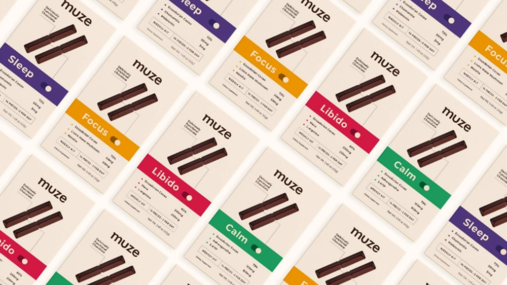
The redesign focused on renewing Muze’s visual identity and building a cohesive packaging system that clearly communicates product benefits. This included refining typography and layout, restructuring informational hierarchy, and developing consistent dielines across formats. At the same time, the design was aligned with the launch of the new functional product line, ensuring each variant had a clear benefit, ingredient spotlight, and stronger brand presence on shelf.
The Mobile Revamped Experience
A concise overview of the most impactful enhancements introduced through the brand and packaging redesign, highlighting the functional, visual, and strategic upgrades that strengthened Muze’s market position.


Clear functional communication
Each product highlights its intended benefit (Sleep, Focus, Stress Relief, Vitality) through simplified hierarchy, ingredient callouts, and clean labeling

Refined packaging architecture
Introduction of consistent dielines, improved typography, structured informational zones, and an updated visual identity that enhances recognition across the product family.

Premium, purpose-driven storytelling
Enhanced visibility of Muze’s social-impact mission (empowering women, promoting inclusion, building sustainable communities) and clearer connection to Ecuadorian fine aroma cacao.

Expanded product ecosystem
Launch of four functional chocolates plus supporting packaging formats (weekly kits, daily dose boxes, foil bags, displays), opening new revenue streams within the dietary supplement market.
Creating an Intuitive and Efficient Digital Experience


User Flows

Visual Design
Conclusion
Through a strategic brand and packaging renewal, Muze strengthened its presence in an increasingly competitive market. The updated identity, combined with an innovative functional product line, positions the company as a modern, purpose-driven chocolate brand that blends indulgence, wellness, and social impact. The redesign not only enhances shelf visibility and communication but also opens new pathways for growth within the booming dietary supplement category.


.webp)


.webp)
.webp)
.webp)
.webp)
.webp)
%20(1).webp)
.webp)
.webp)
.webp)
.webp)
.webp)
.webp)
.webp)
.webp)
.webp)
.webp)
.webp)
.webp)
