


Toni's

.jpg)
%20(1).webp)
Project Context
A rebranding initiative for a 20-year-old family business looking to scale. The project focused on evolving a traditional, "homemade" visual identity into a premium, sophisticated brand that competes in high-end markets without losing its artisanal heritage.

A 20-year-old family brand was stuck in a "homemade" perception, making it difficult to scale or compete in high-end markets. The visual identity lacked the professional authority needed to justify a premium price point and attract modern, quality-seeking consumers.

A 20-year-old family brand was stuck in a "homemade" perception, making it difficult to scale or compete in high-end markets. The visual identity lacked the professional authority needed to justify a premium price point and attract modern, quality-seeking consumers.

We implemented a "Modern Nostalgia" design strategy, refining the visual narrative to be clean and minimalist. By combining high-end typography with subtle heritage elements, we created a brand identity that communicates both artisanal quality and market-leading sophistication.
Testimonials

"Our new brand identity is a game changer. It perfectly captures who we are and has already boosted our professional appeal. If you want to stand out, this is the way to go!"
.png)

"Our new brand identity is a game changer. It perfectly captures who we are and has already boosted our professional appeal. If you want to stand out, this is the way to go!"
Design & Development Process

Briefing
Competitors Analysis
UX Analysis
Definition of User Persona
.png)
Userflow & Sitemap
Lo-Fi & Hi-Fi Wireframes
Clickable Prototype
Usability Testing
.png)
Branding
UI & UI-Kit
Responsive Design
High Fidelity Prototype
Usability Testing
Hand-off to Development
.png)
CMS implementation (WordPress-Elementor / Shopify / Webflow)
CMS Configuration
Responsive Optimization
SEO Improvements (optimized content & images)
Final Testing & QA
Final Project Deployment
Design Process
Briefing
Competitors Analysis
UX Analysis
Definition of User Persona
Userflow & Sitemap
Lo-Fi & Hi-Fi Wireframes
Clickable Prototype
Usability Testing
Branding
UI & UI-Kit
Responsive Design
High Fidelity Prototype
Usability Testing
Hand-off to Development
Color Palette
Typography
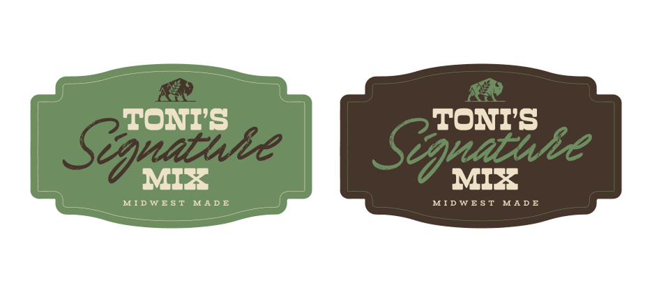
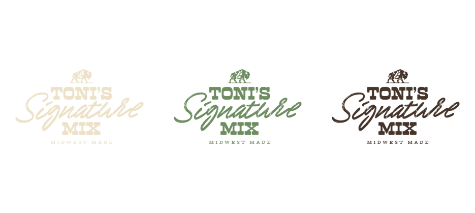
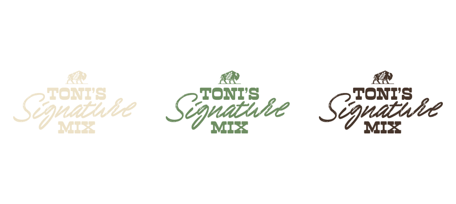
Brand Identity
User Persona
Logo
Lo-Fi Wireframes
Previous Design

The Revamped Experience
A comprehensive brand overhaul designed to transform a traditional family recipe into a premium market contender. We focused on a visual narrative that balances nostalgic “homemade” cues with a sophisticated, modern aesthetic, ensuring the product resonates with quality-seeking consumers while honoring its 20-year heritage.
%201.webp)
%201.webp)
%201.webp)
%201.webp)
%201.png)
%201.png)
%201.png)
%201.png)
The Mobile Revamped Experience

Elevated the brand from a local, "homemade" look to a sophisticated identity that commands a premium presence on any shelf.


Heritage Storytelling
A visual narrative that honors the 20-year history through subtle, nostalgic design cues that maintain emotional connection.

Premium Minimalism
A clean and sophisticated layout designed to elevate the product's perceived value and command a higher market price.

Strategic Typography
A refined selection of modern typefaces that bridge the gap between traditional family roots and contemporary elegance.

Brand Scalability
A versatile identity system built to transform a local "homemade" product into a competitive, professional brand ready for global shelves.
Creating an Intuitive and Efficient Digital Experience

User Flows

Visual Design
Conclusion
This overhaul successfully evolved a 20-year legacy into a premium market leader. By merging nostalgic heritage with modern sophistication, we created a high-end identity that honors its past while maximizing its future commercial value.