

%201.png)


.webp)
%201.png)
KEY TAKEAWAYS
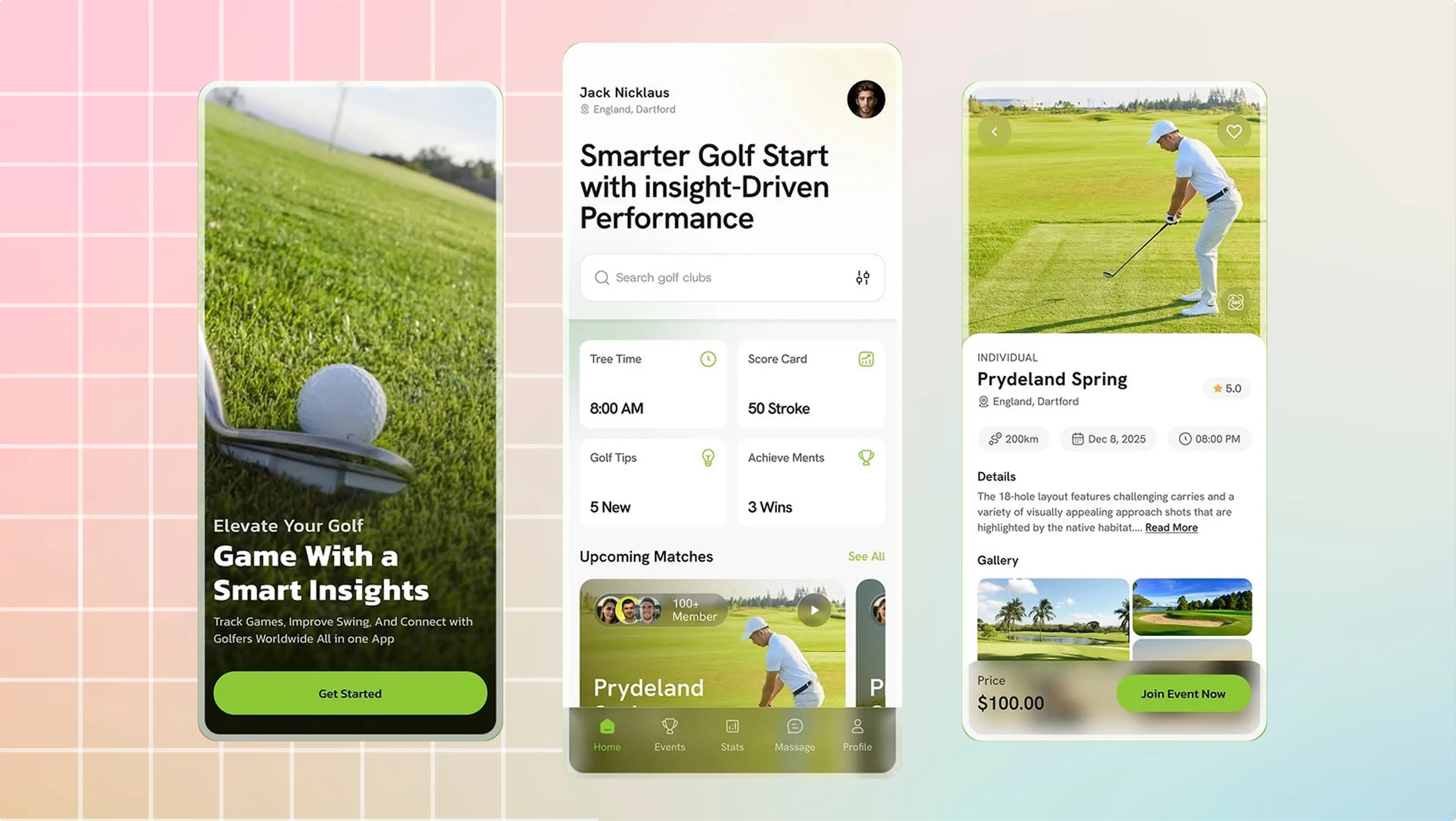
Open twenty golf brand websites in a row and a pattern emerges fast. Beige and forest green. A serif logotype with a small crest. A hero photo of an empty fairway at sunrise, mist still on the grass. Somewhere below the fold, the word tradition.
It is a coherent look. It is also nearly interchangeable, which is a strange outcome for an industry where the businesses are not interchangeable at all.
We have built for four different corners of this industry: a golf apparel brand, a teaching academy, a resort, and a sportstech platform that connects junior players to US college coaches. What became obvious across those four projects is that they were not variations of the same brief. They were four different jobs, and the visual formula that serves one actively hurts the others.
A brand identity in golf is doing one of four jobs
Before deciding what a golf brand should look like, it helps to be honest about what it has to accomplish. In our experience it is almost always one of these four, and rarely more than two at once.
Selling belonging
This is the consumer brand job. Someone is choosing what to wear on a course, and clothing is never only about function. They are deciding how they want to be read by the people they are playing with.
Marie Birdie, based in West Palm Beach, makes colorful and deliberately playful golf apparel for women and girls. The brand has a strong voice. The problem was not awareness, it was that the online store flattened that voice into something generic, and the blog sat in a separate world from the products entirely.
The fix was not a new logo. It was rebuilding the shop around the brand's actual personality, and turning the blog into a content-to-commerce engine so a story about a player could lead somewhere. When a brand's identity is its differentiator, the site's job is to not get in the way.
Selling trust
This is the academy job, and it is the one most often misread.
The person evaluating a golf academy is usually not the golfer. It is a parent, comparing programs, trying to decide where their fifteen-year-old spends the next four years. They cannot evaluate teaching methodology. What they can evaluate is whether the operation looks serious.
Hernán Rey Golf Academy in Orlando trains junior, amateur and professional players and has real standing in that world. The site did not communicate any of it. We built the brand identity and the site around a single objective: make a family feel the academy's credibility before they ever pick up the phone.
The design decisions that follow from that objective are different from the ones that follow from selling belonging. Restraint reads as confidence. Playfulness reads as amateur. The same visual choice that makes an apparel brand feel alive makes an academy feel unserious.
Selling prestige
This is the resort and club job, and it is the hardest to fake.
Montecristi Golf Resort needed a site that reflected its standing to current and prospective members. The words that came up were elegance and exclusivity, which are easy to say and very difficult to execute, because prestige in design is mostly a function of what you leave out.
There is also a practical dimension that gets ignored. Members book from a phone, usually standing somewhere, often deciding in under a minute. A prestige brand with a booking flow that fights a thumb is not communicating prestige, it is communicating that nobody thought about it.
Selling clarity
This is the platform job, and it is the least visual of the four.
Jungle is a recruiting platform that helps junior golfers get visibility with US college coaches, and handles tournament registration through the AJGA. Its dashboard pulls live performance metrics from Junior Golf Hub and Upgame. The identity problem there was not aesthetic at all. It was that a family looking at a wall of performance data could not tell what any of it meant for their kid's chances.
When the product is data, brand identity is largely the discipline of making complicated things feel obvious. Typography hierarchy does more work than a color palette. The measure of success is whether a parent understands the number without asking.
What breaks when you copy the wrong formula
The reason the beige-and-serif template is so common is that it borrows the visual language of prestige, and prestige feels like the safe default in golf. It usually isn't.
An apparel brand that adopts it loses the exact thing that made someone choose it over a legacy brand. An academy that adopts it looks like every other academy, which returns the parent to comparing on price. A platform that adopts it buries the data underneath decoration.
Only the resort is served by it, and even there the template version rarely works, because prestige communicated by cliché is not prestige. It is costume.
The more useful question is not what should a golf brand look like. It is which of the four jobs does mine have to do. That question has a different answer for an apparel label than for a club, and the design follows the answer rather than the category.
A note on where this goes wrong in practice
Most golf businesses do not get a bad identity because someone made bad taste decisions. They get one because the brief was never written. The conversation starts at "we need a new website" and moves straight to references, and references in golf all look the same, so the outcome is decided before anyone has asked what the site is for.
The cheapest intervention available to any golf business is to spend an hour, before hiring anyone, deciding which job the brand has to do. Belonging, trust, prestige, or clarity. Write it down in one sentence. Every design decision after that either serves it or does not, and disagreements become answerable instead of a matter of preference.
How to tell which job yours is doing
This is diagnosable without hiring anyone. Look at your own homepage and answer these.
If your job is belonging: could someone tell your brand apart from three competitors with the logo covered? If the answer is no, the identity is not doing its work, no matter how polished it looks. The test is not whether it is attractive. It is whether it is recognizable.
If your job is trust: what is the first piece of evidence a stranger encounters? Not a claim about excellence — evidence. Named results, named people, institutions you are associated with. Most academy sites lead with adjectives and put the proof three clicks deep, which is exactly backwards for a parent in comparison mode.
If your job is prestige: count the things on your homepage. Prestige is subtractive. Every additional badge, banner and promotional block moves a brand further from exclusive and closer to a listing. If the page is busy, the design is arguing against the positioning.
If your job is clarity: hand your phone to someone outside the business and ask them to explain one number on the screen. If they cannot, the data is decoration. This is the fastest and least comfortable test of the four.
The reason these are worth an hour of your time is that they are answerable before any money changes hands. A brief written from those answers survives contact with a designer. A brief written from a moodboard does not.
If you are about to start
Look at your own site and ask which of the four it is currently performing. Not which one you intended — which one a stranger would say it is doing, in the five seconds before they decide whether to keep reading.
In our experience the gap between those two answers is where most of the opportunity sits.
Ask it on a call. A Growth Audit also shows which pages already bring in customers and what to fix first.

.png)
.png)
Keep reading
.webp)



Not sure where your site is losing customers?
A Growth Audit tells you which pages already work, which ones leak, and what to fix first. Before you commit to a redesign.
Stop letting technical debt limit your revenue. Get a 30-minute strategic diagnostic of your digital infrastructure. No fluff, just strategy.