


Dixie Grace


Project Context
Dixie Grace requested a redesign of its website homepage to better align the digital experience with the brand’s premium positioning. The company offers boiled peanuts elevated into a modern experience, reinventing a traditional snack through its own process (“The Dixie Grace Way”), which combines technique, bold flavors, and practical, high-quality packaging.

The current homepage does not reflect Dixie Grace’s premium positioning nor effectively communicate the product’s unique value. Its design appears amateur, lacks natural visual cues connected to the peanut’s origins, and is not optimized to guide users toward conversion. This creates a gap between the product’s true quality and the perception conveyed by the site, impacting both the brand experience and the ecommerce’s commercial performance.

The goal of the redesign is to elevate brand perception, improve the visual aesthetic, reinforce the product’s natural and authentic qualities, and increase conversion through a clearer, more appealing, and strategically structured homepage.

Redesign the homepage with a professional UX/UI approach that elevates the visual aesthetic, strengthens the brand’s premium identity, and improves conversion. This involves implementing a more natural and modern visual direction, incorporating imagery that connects the product to its origins, optimizing content hierarchy, updating typography, and reorganizing the layout to clearly guide the user toward action. The result will be a cohesive, appealing, and functional homepage that accurately represents Dixie Grace’s value and drives online sales.
A timeless snack, reimagined for today
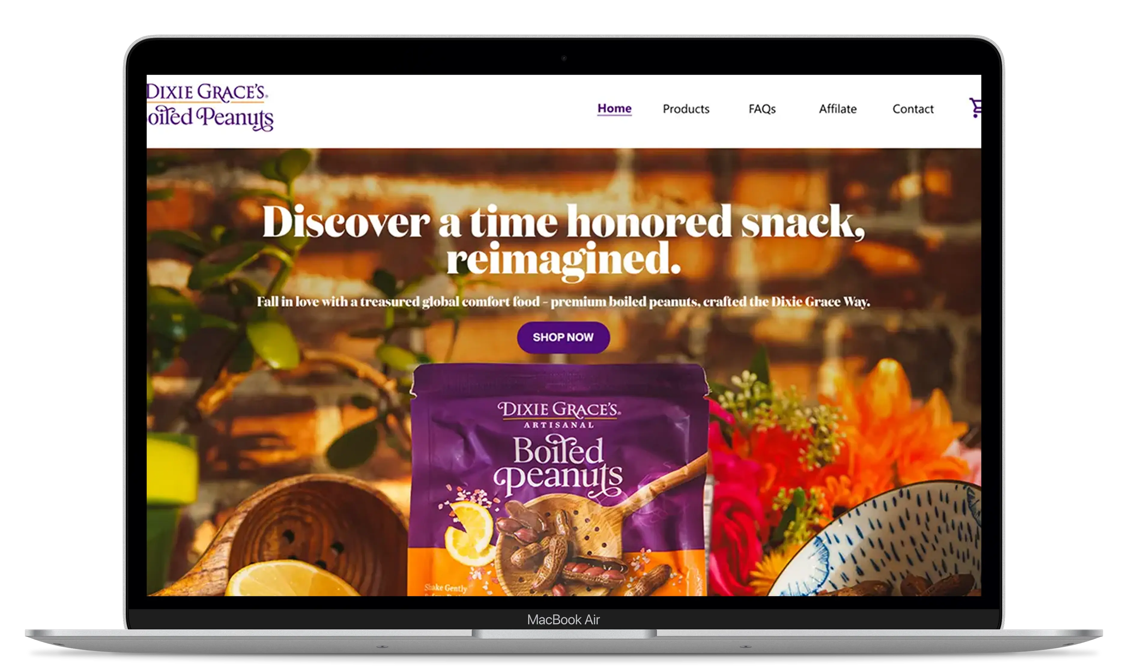
The homepage introduces Dixie Grace's take on a traditional Southern snack, combining heritage-inspired storytelling with vibrant visuals and a modern shopping experience. Through engaging product imagery, clear messaging, and dedicated product sections, the website communicates the brand's personality, product variety, and commitment to quality.

Strong brand identity
A bold hero section introduces Dixie Grace's promise of reimagining a time-honored snack, immediately communicating the brand's personality and Southern roots.
Product storytelling and benefits
Dedicated product sections highlight the different boiled peanut varieties, their ingredients, and key nutritional benefits, helping customers understand what makes each product unique.
Engaging shopping experience
A structured product grid showcases the available products and bundles, with clear descriptions, pricing, and direct shopping options that make discovering and purchasing products simple.
Designed to make a difference
Product comparison
A clear comparison highlights the benefits of Dixie Grace's boiled peanuts, helping customers understand what makes them different from traditional options.
Real customer experiences
Customer videos and testimonials showcase authentic reactions, building trust and giving visitors a genuine look at the product experience.
Product discovery
Detailed product pages highlight flavors, ingredients, and package options, making it easier for customers to explore products and shop confidently.
The story behind the brand
A dedicated storytelling section introduces the founder's journey, Southern roots, and passion for reinventing a traditional snack.
CONTENT INTERACTION
Making it easier to find Dixie Grace
We created an interactive store locator that helps customers find retailers carrying Dixie Grace's Boiled Peanuts. By combining location-based search, an interactive map, and detailed store information, visitors can quickly discover where to buy their favorite products.

Location-based search
Customers can enter their city or ZIP code to find nearby stores carrying Dixie Grace products.

Interactive store map
A dynamic map displays nearby retailers with location markers, making it easy to explore available stores and their proximity.

Detailed store information
Individual store listings provide addresses, contact details, and directions, helping customers plan their visit and find products with ease.
Testimonials


"The redesign completely transformed how Dixie Grace is perceived. We went from an outdated look to a fresh and authentic identity that truly reflects the handcrafted essence of our boiled peanuts. Our customers now understand who we are and what makes us special. The new design elevated our presence, boosted online sales, and helped us stand out. It was worth every penny!"

Here are the key features implemented in the redesign, focused on elevating the visual experience, optimizing navigation, and reinforcing Dixie Grace’s premium positioning—resulting in a more coherent, appealing, and effective homepage.


Optimization of the main copy and messaging
The text was updated to better reflect Dixie Grace’s premium, natural, and modern tone. The new copy clearly communicates the product’s unique value and creates a more cohesive brand experience.

Image selection and enhancement
Images were replaced and refined to achieve a more natural and authentic look aligned with the product’s origins. This brings a more elevated feel and reduces the “cartoonish” aesthetic of the previous design.

Layout redesign to improve navigation
Key sections were reorganized to guide users more intuitively, highlighting packshots, benefits, and calls to action. The visual flow is now clearer, more hierarchical, and more conversion-driven.

Visual refinement to elevate brand aesthetics
Typography and spacing were updated to create a more modern interface aligned with Dixie Grace’s premium positioning. This includes a more balanced integration of purple/orange and the addition of more refined visual elements.
Conclusion
The homepage redesign aligned the digital experience with Dixie Grace’s premium identity, improving message clarity, visual appeal, and overall user flow. The new design elevates brand perception, communicates the product’s value more effectively, and establishes a stronger foundation for higher conversion and a more coherent online presence.