

%201.png)

Revby


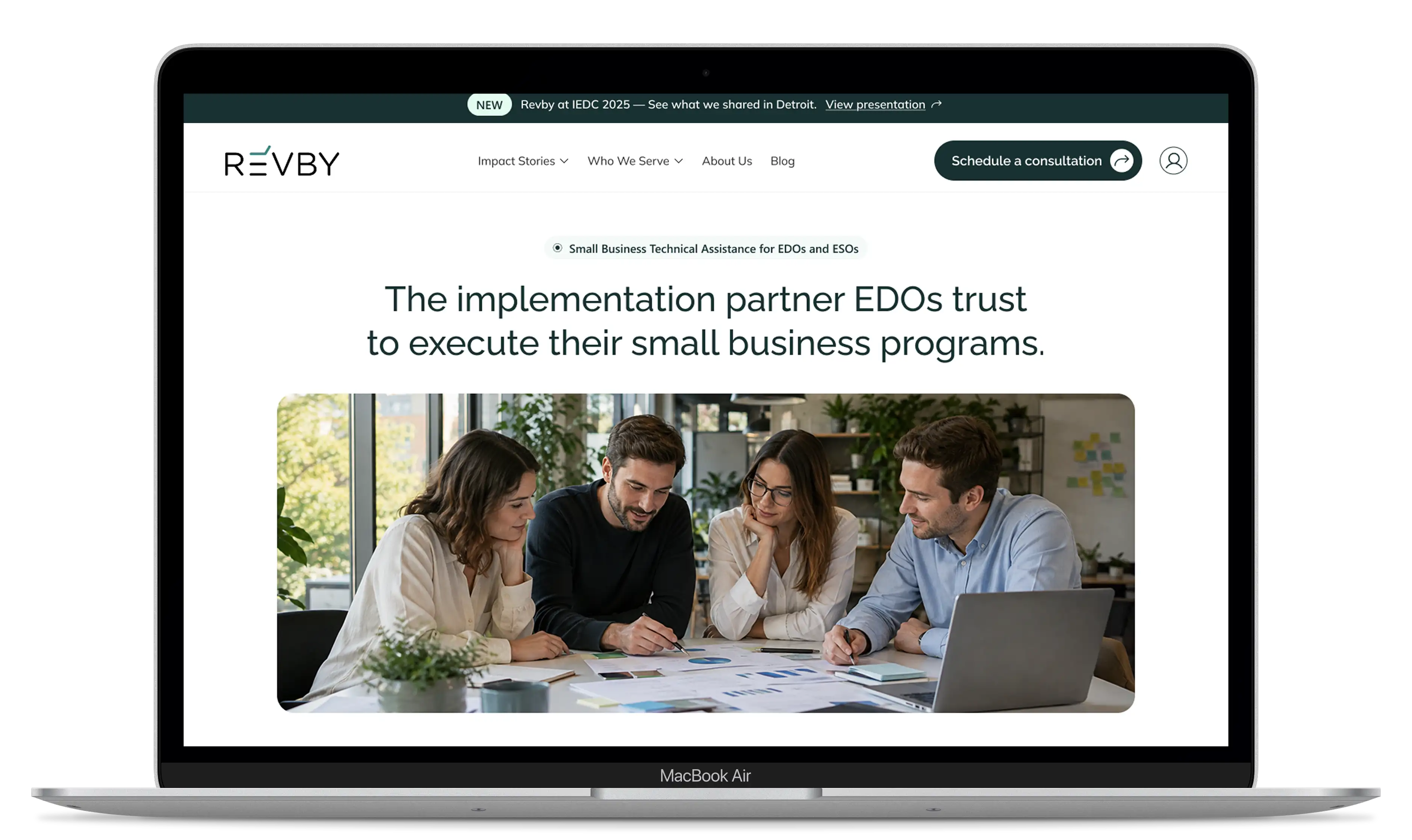
Project Context
Revby works with Economic Development Organizations across the United States, running capital readiness programs that help small business owners become fundable. Their partners include city and state economic development agencies, and their programs are delivered in English and Spanish.

Rebuild the public site around the audience that generates revenue, without losing the credibility built with business owners, and leave Revby able to keep adding stories, outcomes and press releases without going back to a developer.

The site had grown around the wrong reader. Most of the content spoke to small business owners, who are the people Revby serves but not the people who hire Revby. The audience that decides on a contract, an economic development director comparing providers, arrived at a site that never addressed them directly.

We rebuilt the public site on WordPress and Elementor, structured around what an economic development director actually needs to evaluate: who Revby serves, what a program looks like, and proof that it worked. We took over the content direction rather than only designing around supplied copy so that stories are found the way buyers search.
Testimonials


"Pablo and his team were excellent to work with. They spent the time up front to truly understand our needs, and they shared with us their considerable experience, which resulted in an even better end result than we originally envisioned. They also were extremely proactive and responsive to all our requests, truly a pleasure to work with. The effort and creativity they brought to the table set them apart from other digital consultancies we have worked with. I would gladly recommend them."
.webp)
"They understood that we sell to economic development organizations, not to small businesses directly, and built the site around how those buyers decide. The impact stories became a model we will keep using."
"Pablo and his team were excellent to work with. They spent the time up front to truly understand our needs, and they shared with us their considerable experience, which resulted in an even better end result than we originally envisioned. They also were extremely proactive and responsive to all our requests, truly a pleasure to work with. The effort and creativity they brought to the table set them apart from other digital consultancies we have worked with. I would gladly recommend them."
Design & Development Process

Briefing
Competitors Analysis
UX Analysis
Definition of User Persona
.png)
Userflow & Sitemap
Lo-Fi & Hi-Fi Wireframes
Clickable Prototype
Usability Testing
.png)
Branding
UI & UI-Kit
Responsive Design
High Fidelity Prototype
Usability Testing
Hand-off to Development
.png)
CMS implementation (WordPress-Elementor / Shopify / Webflow)
CMS Configuration
Responsive Optimization
SEO Improvements (optimized content & images)
Final Testing & QA
Final Project Deployment
Design Process
Briefing
Competitors Analysis
UX Analysis
Definition of User Persona
Userflow & Sitemap
Lo-Fi & Hi-Fi Wireframes
Clickable Prototype
Usability Testing
Branding
UI & UI-Kit
Responsive Design
High Fidelity Prototype
Usability Testing
Hand-off to Development
Color Palette

Brand Identity
User Persona
Logo
Lo-Fi Wireframes
Previous Design
The old design had a more product- and small-business-focused approach, with a denser visual style and less emphasis on Revby’s broader organizational audience. The content and navigation did not clearly communicate Revby’s strategic role or make its services and impact easy to explore.
%20(2).webp)
%20(1).webp)
%20(1).webp)
%20(1).webp)
%20(1).webp)
%20(1).webp)
%20(1).webp)
%20(1).webp)
%20(1).webp)
%20(1).webp)
%20(1).webp)
%20(1).webp)
%20(1).webp)
%20(1).webp)
%20(1).webp)

The Revamped Experience
The redesign repositions Revby as a clear, modern implementation partner for EDOs and ESOs. The experience prioritizes strategic positioning, clearer service pathways, and stronger social proof, using a cleaner visual system and structured content to make Revby’s capabilities and impact easier to understand.
%20(1).webp)
%20(1).webp)
%20(1).webp)
%20(1).webp)
%20(1).webp)
.webp)
%20(1).webp)
.webp)
.webp)
.webp)
%20(1).webp)
%20(1).webp)

The Mobile Revamped Experience

Revby’s website was redesigned to support a strategic shift from serving small businesses directly to positioning Revby as a trusted technical assistance partner for Economic Development Organizations, Enterprise Support Organizations, and government agencies.


Strategic Positioning
Repositioned the website around Revby’s B2B audience, clearly communicating its role as a technical assistance partner and making its expertise and program capabilities easier to understand.

Information Architecture
Restructured the content and navigation to create clearer pathways to Programs, Impact Stories, About, Resources, and Contact, helping organizational stakeholders quickly find relevant information.

Modern Visual System
Introduced a modern, professional visual direction with a minimalist interface, refined typography, a distinctive green-based color palette, and community-focused imagery to better reflect Revby’s mission and audience.

Stories structured as stories
Revby supplied the raw material and we took the lead on the narrative, applying a conflict-and-resolution structure to each program story.
Creating an Intuitive and Efficient Digital Experience

The redesign process
We started by aligning the website with Revby’s new target audience and strategic direction. We then restructured the content, simplified navigation, and developed a new visual system focused on clarity, credibility, and community.
User Flows
The experience guides users from discovering Revby and its capabilities to exploring programs and impact stories, and ultimately connecting with the team.

Visual Design
A modern, minimalist visual system combines strong typography, a refined green palette, spacious layouts, and community-focused imagery.
Conclusion
The redesign created a clearer and more strategic digital experience aligned with Revby’s target audience. A stronger content structure, simplified navigation, and modern visual system make Revby’s expertise and impact easier to understand while creating a flexible foundation for future growth.
Not sure where your site is losing customers?
A Growth Audit tells you which pages already convert, which searches you are invisible for, and whether your inquiries record a source. You keep the findings either way.