

%201.png)

The Non Dummies


Project Context
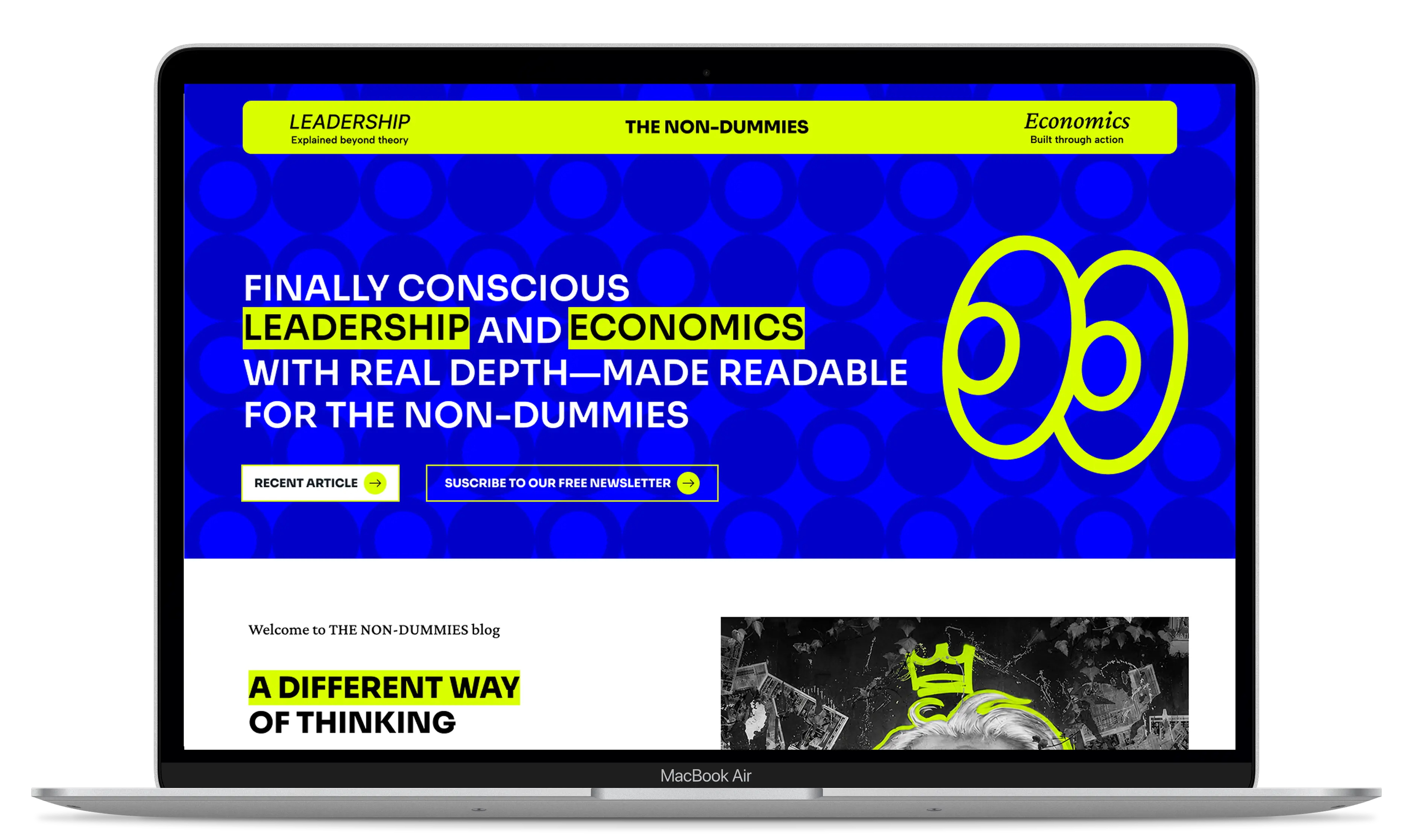
Gary Radtke, a U.S.-based economist, needed a blog-focused website where he could share insights on economics and leadership in a more engaging and effective way. His goal was to create a platform that reflected his personality while making it easy to publish articles, moving away from the traditional financial blog aesthetic toward a modern, dynamic, and engaging experience.

Design and develop a modern blog that improves the reading experience, strengthens Gary's personal brand, and makes it easier to consistently publish content about economics and leadership.

Blogs in this industry often feel rigid, cluttered, and unappealing to digital audiences. Gary needed a platform that conveyed credibility without sacrificing approachability, encouraging users to explore and consume content naturally.

We created a modern editorial experience rooted in UX, starting with user research, information architecture, and Figma prototyping, then developing the site in WordPress with an intuitive CMS that made content management and publishing simple.
Testimonials
.webp)

"The team understood exactly what I envisioned for my blog. The result is modern, easy to manage, and reflects how I want to communicate my ideas."


"The team understood exactly what I envisioned for my blog. The result is modern, easy to manage, and reflects how I want to communicate my ideas."
Design & Development Process

Briefing
Competitors Analysis
UX Analysis
Definition of User Persona
.png)
Userflow & Sitemap
Lo-Fi & Hi-Fi Wireframes
Clickable Prototype
Usability Testing
.png)
Branding
UI & UI-Kit
Responsive Design
High Fidelity Prototype
Usability Testing
Hand-off to Development
.png)
CMS implementation (WordPress-Elementor / Shopify / Webflow)
CMS Configuration
Responsive Optimization
SEO Improvements (optimized content & images)
Final Testing & QA
Final Project Deployment
Design Process
Briefing
Competitors Analysis
UX Analysis
Definition of User Persona
Userflow & Sitemap
Lo-Fi & Hi-Fi Wireframes
Clickable Prototype
Usability Testing
Branding
UI & UI-Kit
Responsive Design
High Fidelity Prototype
Usability Testing
Hand-off to Development
Color Palette
Brand Identity
User Persona
Logo
Lo-Fi Wireframes
Previous Design


The Revamped Experience
The visual design was crafted with a modern editorial aesthetic that breaks away from the traditional look of economics blogs. We used a vibrant color palette to bring energy and personality while maintaining a clean interface that keeps the content at the center of the experience. To reinforce the playful character of the brand, we incorporated hand-drawn doodles and expressive illustrations, making complex topics feel more approachable without compromising credibility.
.webp)
.webp)
.webp)
.webp)
.webp)
.webp)
.webp)
.webp)
.webp)
.webp)
.webp)
.webp)
.webp)
.webp)
The Mobile Revamped Experience

The project focused on transforming a traditional blog into a more engaging editorial platform by prioritizing readability, navigation, and effortless content management.


Modern Editorial Experience
We designed a magazine-inspired interface that made articles more engaging and easier to consume.

Reading-Focused UX
We optimized visual hierarchy, typography, and spacing to improve the readability of long-form content.

Intuitive CMS
We developed the website in WordPress so Gary could publish and manage content independently.

Stronger Personal Brand
We created a contemporary visual identity that communicates professionalism while remaining approachable.
Creating an Intuitive and Efficient Digital Experience

The Design Process
The process started by defining the content structure and core user journeys. We then created wireframes and high-fidelity prototypes in Figma to validate the experience before implementing the design in WordPress. Finally, we built an optimized CMS for frequent content publishing.
User Flows
Entry through search or social media. Article reading. Related content discovery. Category exploration. Continued engagement through seamless article navigation.

Visual Design
The visual identity combines a contemporary editorial aesthetic with a clean, dynamic interface. Generous whitespace, expressive typography, and clear visual hierarchy make complex topics like economics and leadership feel more approachable.
Conclusion
The project transformed Gary's vision into a platform built for consistent knowledge sharing. By combining UX, prototyping, and WordPress development, we delivered a modern blog that balances credibility, personality, and an outstanding reading experience.
Not sure where your site is losing customers?
A Growth Audit tells you which pages already convert, which searches you are invisible for, and whether your inquiries record a source. You keep the findings either way.