


Revby Impact Stories


Project Context
Revby needed to show an economic development agency what a capital readinessprogram actually produces. The first of these stories covers Capital Connect, abilingual program run with the State of New Mexico in which nineteen smallbusinesses completed financial education and one-to-one consulting. A summarypage would not carry it. The format had to make a reader feel the arc.

Common challenges with scrollytelling pluginsScrollytelling is often implemented through third-party plugins, which can introduce key limitations: external dependencies, poor SEO visibility, and recurring subscription costs that become harder to scale with multiple stories.

Build a scrolling narrative that reads as a genuine experience rather than astyled article, while keeping the content indexable, owned, and free ofrecurring cost or external dependency.

We built it as a custom WordPress plugin instead of embedding a third-partytool. The content stays in the page, so search engines and AI assistants canread and cite it. There is no external service to depend on and no subscriptionthat grows with each new story.
A website built around measurable impact
We designed a modern website that communicates Revby's mission and connects organizations with the support they need through clear messaging, structured content, and engaging visuals.

Clear positioning
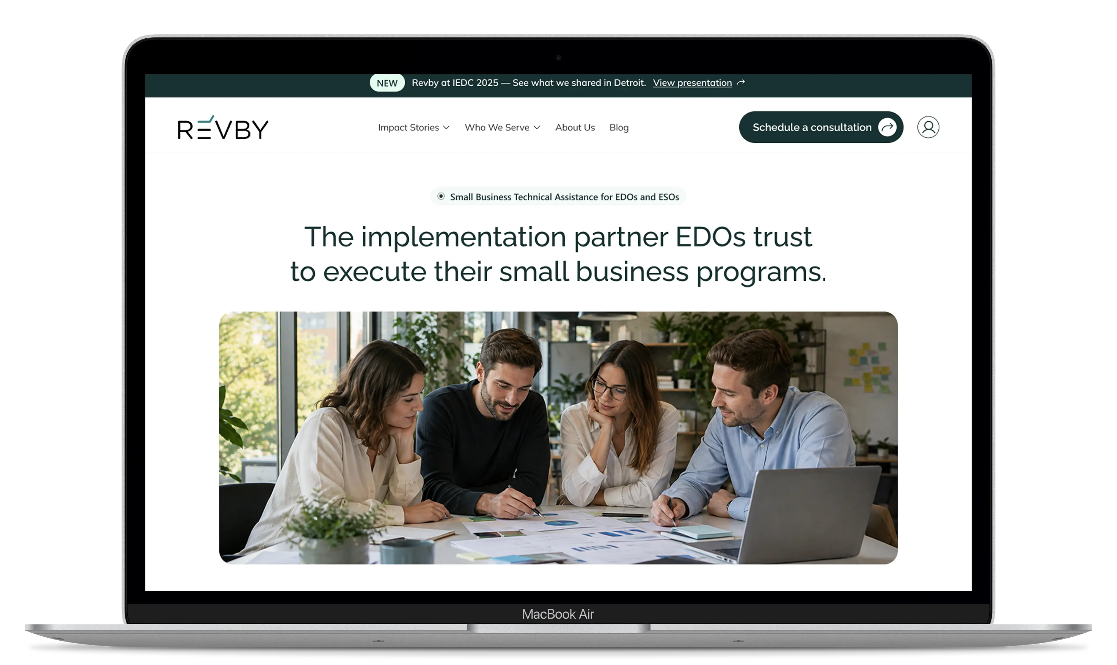
A focused hero communicates Revby's role as a trusted implementation partner.
Organized services
Dedicated sections make it easy to explore programs, expertise, and technical assistance.
Impact storytelling
Stories, results, and testimonials showcase Revby's work and the value of its programs.
Bringing Revby to Life
Program Details at a Glance
We organized program information into clear, engaging sections, highlighting key deliverables and making complex services easier to understand.
Meet the Team Behind Revby
We created a welcoming About Us experience that combines the company's mission, core values, team profiles, and contact information to build trust and connection.
CONTENT INTERACTION
Bringing impact stories to life
We designed an engaging storytelling experience that highlights Revby's work and measurable results. Through dynamic visuals, interactive sections, and clear content, each story becomes easier to explore and understand.

Immersive Storytelling
Visual transitions and editorial layouts bring each impact story to life.

Interactive Content
Scroll-driven sections reveal key information and guide visitors through the story.

Measurable Impact
Highlighted results, testimonials, and program details showcase the real value of Revby's work.
Showcasing Revby's Impact
Revby in the News
A clean editorial layout highlights press coverage and media mentions, making it easy to explore Revby's latest news and recognition.
Exploring Ideas and Insights
A structured blog experience showcases articles through engaging visuals, clear categories, and intuitive navigation.
Impact Stories in Focus
A dedicated article layout combines video, structured content, and clear navigation to bring Revby's success stories to life.
Testimonials


"They understood that we sell to economic development organizations, not to small businesses directly, and built the site around how those buyers decide. The impact stories became a model we will keep using."

Revby’s website was redesigned to support a strategic shift from serving small businesses directly to positioning Revby as a trusted technical assistance partner for Economic Development Organizations, Enterprise Support Organizations, and government agencies.


Strategic Positioning
Repositioned the website around Revby’s B2B audience, clearly communicating its role as a technical assistance partner and making its expertise and program capabilities easier to understand.

Information Architecture
Restructured the content and navigation to create clearer pathways to Programs, Impact Stories, About, Resources, and Contact, helping organizational stakeholders quickly find relevant information.

Modern Visual System
Introduced a modern, professional visual direction with a minimalist interface, refined typography, a distinctive green-based color palette, and community-focused imagery to better reflect Revby’s mission and audience.

Stories structured as stories
Revby supplied the raw material and we took the lead on the narrative, applying a conflict-and-resolution structure to each program story.
Conclusion
The redesign created a clearer and more strategic digital experience aligned with Revby’s target audience. A stronger content structure, simplified navigation, and modern visual system make Revby’s expertise and impact easier to understand while creating a flexible foundation for future growth.